Its very easy to write **a lot **of automated tests when building an application. As applications grow, you'll see the total time it takes to run these tests grow too.
As this number grows however, it's increasingly difficult to see exactly where the time accumulates in the test suites. This isn't a huge problem from the outset, but when you start running tests in areas like CI for deploying to production, or on staging servers. On its own a test that takes 200ms instead of 50ms isn't so bad, but when you have over a thousand tests, you'll really start to feel it. Whether that's delay in your team's cycle time, or cost of hosted test runners.
There is a very simple strategy that I've employed in the past to help combat this, and it relies on very basic visual management using an aptly named tool - PHPUnit Report. We'll use this to create a graph visualization of our test suites to gain insight into any slow tests that might lurk under the water.

How do I get this output for my test suites?
When you run tests in PHPUnit, you can choose to create an output log of all the tests run. This creates an output log in XML format that we can use to analyze our tests once the test suite has finished.
To tell PHPUnit to output to log files, you can add the following to your phpunit.xml configuration file
<logging>
  	// This is the one we need!
    <junit outputFile=".phpunit.report.xml"/>
</logging>
You can read more about the logging configuration in the PHPUnit documentation
Alternatively, you can provide a command line argument to tell PHPUnit where to output the log file to. They both result in the same outcome.
vendor/bin/phpunit --log-junit=".phpunit.report.xml"

# or if you're using PestPHP like me...
vendor/bin/pest --log-junit=".phpunit.report.xml"
Once you've run your test suite with either the logging command or the phpunit.xml configuration, you'll see something like the following in your .phpunit.report.xml file:
<?xml version="1.0" encoding="UTF-8"?>
<testsuites>
  <testsuite name="" tests="5" assertions="5" errors="0" warnings="0" failures="0" skipped="0" time="1.032041">
    <testsuite name="P\Tests\ExampleTest" file="/home/cbow/unit-testing-visualization/vendor/pestphp/pest/src/Factories/TestCaseFactory.php(222) : eval()'d code" tests="5" assertions="5" errors="0" warnings="0" failures="0" skipped="0" time="1.032041">
      <testcase name="it does one thing" assertions="1" time="0.011102"/>
      <testcase name="it does another thing" assertions="1" time="0.730591"/>
      <testcase name="it does a third thing" assertions="1" time="0.054137"/>
      <testcase name="it does a fourth thing" assertions="1" time="0.021103"/>
      <testcase name="it does a fifth thing" assertions="1" time="0.024108"/>
      <testcase name="it does a sixth thing" assertions="1" time="0.014108"/>
      <testcase name="it does a seventh thing" assertions="1" time="0.034108"/>
    </testsuite>
  </testsuite>
</testsuites>
As you can see we've got a few useful bits of information provided in this output. You get the name of each test suite, with details about the number of assertions, failures, warnings, etc... You also see the same breakdown for each testcase inside that test suite.
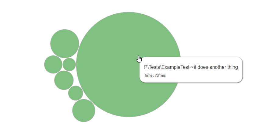
While this is helpful, it doesn't really give us a very visual understanding of what's going on in our test suites. That's where this visualization graph tool comes in. It renders a series of bubbles on a graph, the size of which is determined by how long a test took to run, relative to the other tests in the report.
Its super simple to use. Just copy and paste your XML report into the input provided and click generate. You should end up with something like this (generated from the report above):

If you hover over the blobs in the graph, it'll show you details about the tests that they represent:

It's immediately obvious where the problem is here (spoiler - it's the big one!). Where the report could have told us that this test was much slower than the rest, this graph visualization really brings it to your attention. You can see that its taking 730ms. Compared to the next slowest test, that's a 1253.7% increase in the time taken to run!
While this example is a little contrived. I hope you can see the benefit that this visualization tool can bring to a project. It takes less than five minutes to produce a report like this, then you can iron out the slower tests and save yourself a serious amount of time in the long term.
This approach is also great for motivating teams to speed up tests. Simply standing up and saying "we've got to speed up our tests to save time and money... etc" might not have the impact you want on a team of developers, and it might not motivate them quite as much as you'd like. Being able to gather everyone around (virtually or otherwise) and show them a graph like the above to highlight exactly where (and with who!) the problems lie can really light a fire under certain characters.
I hope this helps in your testing journey. 🎉
And finally, a big thanks to Marmelab for building such an epic and simple use tool.

 Laravel
 Php
Php
 Email
Email
 Git
Git
 Javascript
 Docker
 IDE
IDE
 Clean Code
 Eloquent
 Kubernetes
 Blade
Blade
 AlpineJs
No comments yet…